Posted at 14:57h
in
by hbortiz
Hair 365 is a hair care brand that blends the finest natural ingredients with advanced technology to provide you with healthy, manageable hair every day.
The rebranding concept focuses on introducing minimalist, natural, and luxurious packaging and labeling.
The proposal features clean products with a neutral color...
Posted at 22:29h
in
by hbortiz
This proposal was an interesting exercise about redesign ordinary generic packaging. The original product is a medicine box from a generic brand.
The result was a minimalistic blue and white proposal. All the extra elements from the current design were deleted to welcome a simple ilustration...
Posted at 17:34h
in
by hbortiz
La Nona Jessy is a peruvian brand that don't just create desserts; it craft experiences reminiscent of the warmth and love found in a grandmother's kitchen. the brand is inspired by the cherished tradition of homemade treats, where every bite tells a story of family...
Posted at 22:03h
in
by hbortiz
This branding project is for a Oriental Fusion kitchen restaurant in Ciudad Victoria, Tamaulipas; México.
This proposal is a celebration of tradition and innovation. Drawing inspiration from the organic beauty of Asian calligraphy, the logo pays homage to the graceful strokes and fluidity of Asian characters....
Posted at 20:47h
in
by hbortiz
This is a redesign project for a local fashion retail shop nestled in the heart of Ciudad Victoria, Tamaulipas. This comprehensive overhaul of the brand identity promises to infuse a breath of fresh air into the fashion scene, blending elegance, modernity, and approachability in perfect...
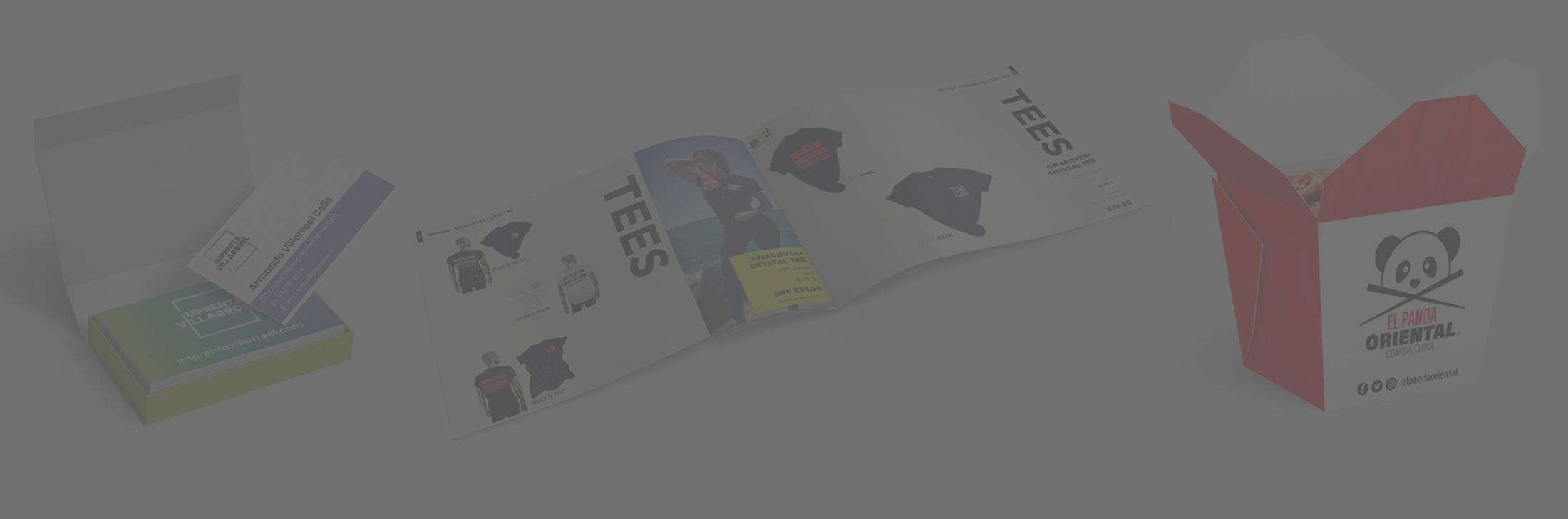
Posted at 21:52h
in
by hbortiz
Informative marketing catalog, for internal distribution of the corporation....
Posted at 21:03h
in
by hbortiz
As part of a real exercise for the Master in Challenging Branding, I designed a special edition identity, that reflects the 20 years of constant evolution and dedication for each of the Don Leo wines.
The result was a label with organic lines that resemble the...
Posted at 15:04h
in
by hbortiz
These selected web design projects reflect a combination of visual design expertise and user experience thinking. Each piece was developed with a clear understanding of the brand, its audience, and the intended user journey, balancing aesthetics with usability. The approach goes beyond visual appeal, focusing...
Posted at 17:17h
in
by hbortiz
Family business dedicated to printing services. The concept of the brand is to create a seal of quality without falling into the typical colors of this sector.
The result is a timeless logo, with a color scheme that stands out and bold typography to be present...
Posted at 15:04h
in
by hbortiz
Sik & Carmona is a Mexican technology company with a vision of innovation.
The concept was to translate the name into a symbol, for which the runic alphabet was used to create a unique and minimalist identity.
The final symbol evokes growth, a bird that wants to...